library(owidapi)library(ggplot2)library(data.table)library(geofacet)library(showtext)library(sysfonts)library(ggtext)# Retrieve life satisfaction distribution data from OWIDdat <-owid_get(chart_id ="happiness-cantril-ladder")setDT(dat)# i want to keep only african countries:data("africa_countries_grid1", package ="geofacet")cty <- africa_countries_grid1# recode differently names countriesdat <- dat[, entity_name :=fcase( entity_name =="Democratic Republic of Congo" , "Democratic Republic of the Congo", entity_name =="Cote d'Ivoire", "Côte d'Ivoire", entity_name =="Republic of Congo", "Congo",default = entity_name)]# merge and remove empty codesdat_cty <- dat[cty, on = .(entity_name = name)][!is.na(code)]dat_cty[, avg_score :=mean(cantril_ladder_score, na.rm =TRUE), by = year]#------ Colors and fontsfont_add_google("Nunito", "Nunito")showtext_auto()showtext_opts(dpi =600)body_font <-"Nunito"title_font <-"Nunito"col_fill <-"#00CFC8"col_line <-"#112D4E"panel_bg_col <-"#F0F0F0"bg_col <-"#FFFFFF"text_col <-"#2A2A2A"# Updated tag with engaging explanationtag <-" <span style='font-size:20pt;color:#00CFC8;'>**Self-Reported Life Satisfaction in Africa**</span><br> <span style='font-size:12pt;color:#2A2A2A;'>The Cantril Ladder is a tool used to measure life satisfaction. Imagine a ladder with 11 steps: <span style='color:#2A2A2A;'>**0**</span> represents the *worst possible life* and <span style='color:#00CFC8;'>**10**</span> represents the *best possible life*. People rate their current lives on this scale, offering a snapshot of well-being.</span><br> <span style='font-size:12pt;color:#2A2A2A;'>This visualization focuses on African countries from 2011 to 2020. The <span style='color:#00CFC8;'>**aquamarine areas**</span> show yearly country averages, while the <span style='color:#112D4E;'>**midnight line**</span> represents the average score across all African countries This average provides a benchmark for comparison.</span> <span style='font-size:12pt;color:#2A2A2A;'> Note data is missing for given years, for instance in Djibouti (DJ) or South Sudan (SSD), or entirely for certain countries like Eritrea (ER) or Capo Verde (CV).<br> <span style='font-size:9pt;color:#6D6D6D;'>Data: Our World in Data on Self-Reported Life Satisfaction | Viz: @gnoblet</span>"g <-ggplot(dat_cty, aes(x = year, y = cantril_ladder_score, group = code)) +geom_area(fill = col_fill, alpha =0.3) +geom_line(aes(y = avg_score), color = col_line, linewidth =0.5) +labs(tag = tag,x =NULL,y =NULL ) +scale_y_continuous(limits =c(0, 10)) +theme_minimal() +facet_geo(~ code, grid ="africa_countries_grid1") +theme(text =element_text(family = body_font, color = text_col),axis.text =element_blank(),panel.background =element_rect(fill = panel_bg_col, color =NA),plot.background =element_rect(fill = bg_col, color =NA),panel.grid =element_blank(),plot.margin =margin(20,450, 20, 20),plot.tag.position =c(1.1, 0.5),plot.tag =element_textbox_simple(width =unit(4.3, "inch"),lineheight =1.2,hjust =0,maxwidth =1 ),strip.text =element_text(color = text_col, size =9) )# saveggsave("day_09.png",dpi =600,width =13,height =11)
Final Plot
Notes
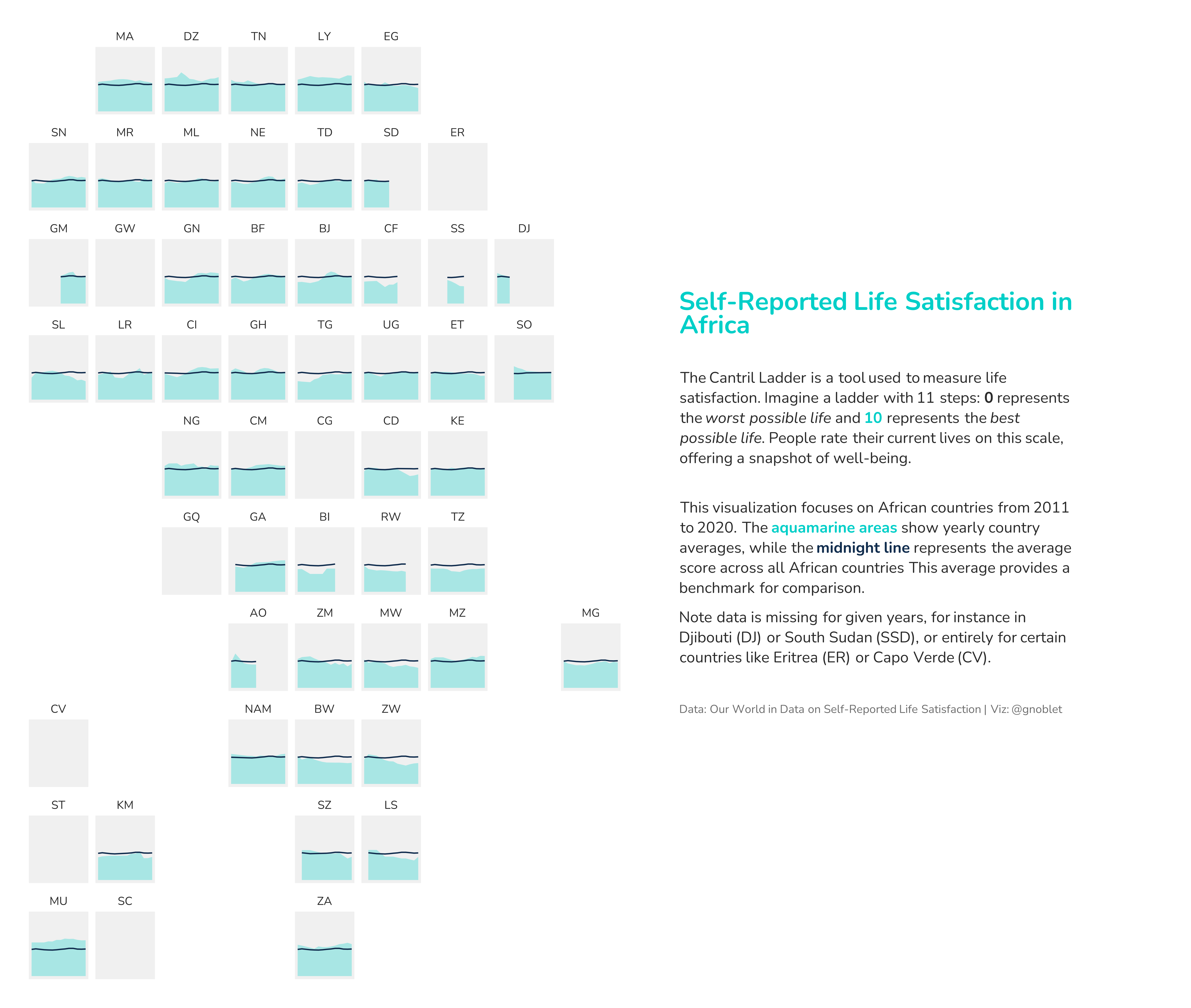
This visualization displays self-reported life satisfaction scores across African countries using small multiples arranged in a geofacet grid that preserves the approximate geographic relationships between countries.
Data source: Our World in Data on Self-Reported Life Satisfaction (Cantril Ladder scores)
Tools used:
owidapi (for retrieving happiness data from Our World in Data)
geofacet (for creating the geographically arranged grid)
ggplot2 (for visualization)
ggtext (for rich text annotations)
showtext (for typography management)
The visualization uses area charts to show trends in life satisfaction scores for each country from 2011 to 2020, with a dark blue reference line showing the average across all African nations. The aquamarine areas represent country-specific values on the 0-10 Cantril Ladder scale, where 0 represents the worst possible life and 10 the best possible life. This approach allows for easy comparison between countries while maintaining their geographic context.