Code
library (ggplot2)library (HistData)library (dplyr)library (extrafont)library (cranlogs)<- "HistData" <- cran_downloads (package_name, from = "2021-01-01" , to = Sys.Date ())<- quantile (downloads$ count, 0.25 )<- quantile (downloads$ count, 0.75 )<- Q3 - Q1<- Q1 - 1.5 * IQR<- Q3 + 1.5 * IQR<- downloads |> :: filter (count >= lower_bound & count <= upper_bound)ggplot (downloads, aes (count)) + geom_histogram (aes (y = after_stat (density)),binwidth = 10 , color = "#F5F5DC" , fill = "#D4AF37" ) + geom_density (color = "#8B4513" ) + scale_y_continuous (name = "Density" ,sec.axis = sec_axis (trans = ~ . * nrow (downloads) * 10 ,name = "Counts" + labs (title = "A True Hist-ogram" ,subtitle = "Weekly downloads of HistData Package from CRAN" ,x = NULL ,y = NULL ,caption = "1.5 IQR Outliers removed | Data: CRAN | Plot: @gnoblet" + #scales_x_ theme_minimal () + theme (plot.background = element_rect (fill = "#F5F5DC" ),panel.grid.major = element_blank (),panel.background = element_rect (fill = "#F5F5DC" ),panel.border = element_rect (color = "#8B4513" , linewidth = 2 , fill = NA ),plot.title = element_text (hjust = 0.5 , family = "Old English Text MT" , size = 24 , color = "#8B4513" ),plot.subtitle = element_text (hjust = 0.5 , family = "Old English Text MT" , size = 18 , color = "#8B4513" ),axis.title.x = element_text (family = "Old English Text MT" , size = 16 , color = "#8B4513" ),axis.title.y = element_text (family = "Old English Text MT" , size = 16 , color = "#8B4513" ),axis.text = element_text (family = "Old English Text MT" , size= 14 , color = "#8B4513" ),plot.caption = element_text (family = "Old English Text MT" , size = 10 , color = "#8B4513" )
Code
# Save ggsave ("day_08.png" , width = 8 , height = 6 , dpi = 300 )
Final Plot
Notes
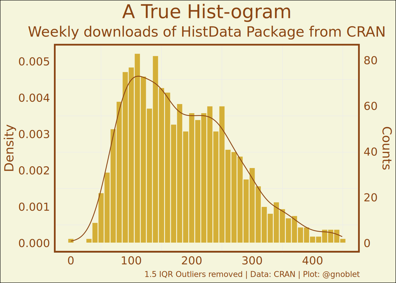
This visualization creates a histogram with overlaid density curve showing the weekly download counts for the HistData package from CRAN. The design incorporates a playful historical aesthetic to match the “hist” in both histogram and the HistData package name.
Data source: CRAN package download statistics (via cranlogs package)
Tools used:
cranlogs (for retrieving CRAN download statistics)
dplyr (for data manipulation)
ggplot2 (for visualization)
extrafont (for historical typography)
The visualization removes outliers using the 1.5 × IQR method to focus on the typical download patterns. The historical manuscript aesthetic is achieved through careful color selection (parchment background, brown ink text) and the use of Old English Text font family, creating a visual pun on the “hist” theme.