# Load required packageslibrary(owidapi) # for data retrieval from OWIDlibrary(stringr) # for string manipulationlibrary(data.table) # for data manipulationlibrary(ggplot2) # for visualizationlibrary(ggtext) # for text formattinglibrary(paletteer) # for color paletteslibrary(scales) # for axis formattinglibrary(dplyr) # for rowwise not imported by ggsankeylibrary(gghighlight) # for highlighting certain countrieslibrary(showtext) # for fontslibrary(ggsankey) # for Sankey diagram# For this visualization, we'll focus on maize production onlydat <-owid_get('maize-production')colnames(dat)[4] <-"tonnes"setDT(dat)# Remove non-country entities (regions, income groups, etc.)entity_to_rm <-c('World','Americas (FAO)','High-income countries','North America','Upper-middle-income countries','Asia','Eastern Asia (FAO)','China (FAO)','Europe (FAO)','South America (FAO)','South America','Lower-middle-income countries','European Union (27) (FAO)','European Union (27)','Africa (FAO)','Africa','Eastern Europe (FAO)','Net Food Importing Developing Countries (FAO)','Low Income Food Deficit Countries (FAO)','Least Developed Countries (FAO)','Southern Europe (FAO)','Net Food Importing Developing Countries (FAO)','Low Income Food Deficit Countries (FAO)','Least Developed Countries (FAO)','Southern Europe (FAO)','South-eastern Asia (FAO)','Central America (FAO)','Southern Asia (FAO)','Land Locked Developing Countries (FAO)','Eastern Africa (FAO)','Western Europe (FAO)','Low-income countries','Southern Africa (FAO)','Western Africa (FAO)','Western Asia (FAO)','Middle Africa (FAO)','Northern Africa (FAO)','Small Island Developing States (FAO)','Caribbean (FAO)','Oceania (FAO)','Central Asia (FAO)','Northern Europe (FAO)','Belgium-Luxembourg (FAO)','Asia (FAO)','Northern America (FAO)','Europe','Micronesia (FAO)')dat <- dat[!entity_name %in% entity_to_rm]# Keep only data every 10 years for clearer visualization of trendsdat <- dat[year %%10==0]# Add new en variable since ggsankey transforms datadat$en <- dat$entity_name# Identify the top 10 countries by total maize productiondat_top10 <- dat[, .(tonnes =sum(tonnes, na.rm =TRUE)), by = .(entity_name)][order(-tonnes)][1:10]entity_top10 <- dat[, .(tonnes =sum(tonnes, na.rm =TRUE)), by = .(entity_name)][order(-tonnes)][1:10][, entity_name]dat_top10 <- dat[entity_name %in% entity_top10]# Create highlight grouping variable using data.tabledat_top10[, highlight_group :=ifelse( entity_name %in%c("Argentina", "Brazil", "China", "India", 'Mexico', 'United States'), entity_name,"Other")]# Arrange and factor by highlight groupsetorder(dat_top10, tonnes)# Factorize highlight groupdat_top10[, highlight_group :=factor(highlight_group, levels =c("Argentina", "Brazil", "China", "India", "United States", "Mexico", "Other"))]# Get the maximum year for proper positioningmax_year <-max(dat_top10$year)# Between band spacesspace <-5e6# Color palettepal <-c('#778BD0FF', '#E2D76BFF', '#95BF78FF', '#4E6A3DFF', '#5F4F38FF', '#D88782FF', '#D3D3D3')# Fontsfont_add_google("Nunito", "nunito")# Create labels, Calculate reversed positions against totaldat_labels <- dat_top10[year ==max(year)][order(tonnes) # Equivalent to arrange(desc(tonnes))][, `:=`(total_production =sum(tonnes),cumulative_tonnes =cumsum(tonnes),band_index = .I)][, `:=`(# Reverse by subtracting from totallabel_y = cumulative_tonnes - (tonnes /2) + (band_index -1) * space,label_x = year +0.5)][highlight_group !="Other"] # Filter out "Other" category# Create the visualization with labelsg <-ggplot() +geom_sankey_bump(data = dat_top10,aes(x = year,y = tonnes,node = entity_name,fill = highlight_group,value = tonnes,label = entity_name ),space =5e6,alpha =0.7,type ='alluvial' ) +# Add country labels at end pointsgeom_text(data = dat_labels,aes(x = label_x, y = label_y, label = highlight_group, color = highlight_group),hjust =0, # Left-align textvjust =0.5,size =4,fontface ="bold",show.legend =FALSE ) +scale_fill_manual(values = pal, guide ="none") +scale_color_manual(values = pal, guide ="none" ) +scale_y_continuous(labels = scales::label_number(scale_cut = scales::cut_short_scale()),expand =c(0, 0) ) +coord_cartesian(clip ="off") +labs(x ="",y ="",caption ="Data source: Our World in Data - Agricultural Production | Visualization: @gnoblet" ) +theme_bw() +theme(text =element_text(family ="Nunito"),legend.position ="right",plot.title =element_text(face ="bold", size =20),plot.subtitle =element_text(size =16),plot.caption =element_text(size =12),panel.grid.minor =element_blank(),panel.grid.major.x =element_blank(),panel.grid.major.y =element_blank(),axis.text =element_text(size =12),axis.text.y=element_blank(),axis.ticks.y=element_blank(),plot.margin =margin(20, 80, 20, 20),panel.border =element_blank() ) +geom_textbox(aes(label ="<span style='font-size:20pt; font-family:Nunito; font-weight:bold;'>Global Maize Production Trends (1970-2020)</span>"),x =1969,y =890e6,fill =NA,hjust =0,fontface ='bold',width =unit(450, "pt"),box.colour =NA) +geom_textbox(aes(label ="<span style='font-size:16pt; font-family:Nunito; line-height:1.8;'> Global maize production for the top 10 producing countries grew from 197M to 897M tonnes in 50 years. Ranking did not change for the top 3 countries as production is largely dominated by the United States, China, and Brazil.</span>"),x =1969,y =850e6,fill =NA,hjust =0,vjust =1,lineheight =1.9,width =unit(360, "pt"),box.colour =NA)# Save the plot at high resolutionggsave("day_05.png",plot = g,height =9,width =10,dpi =600,type ="cairo-png")
Final Plot
Notes
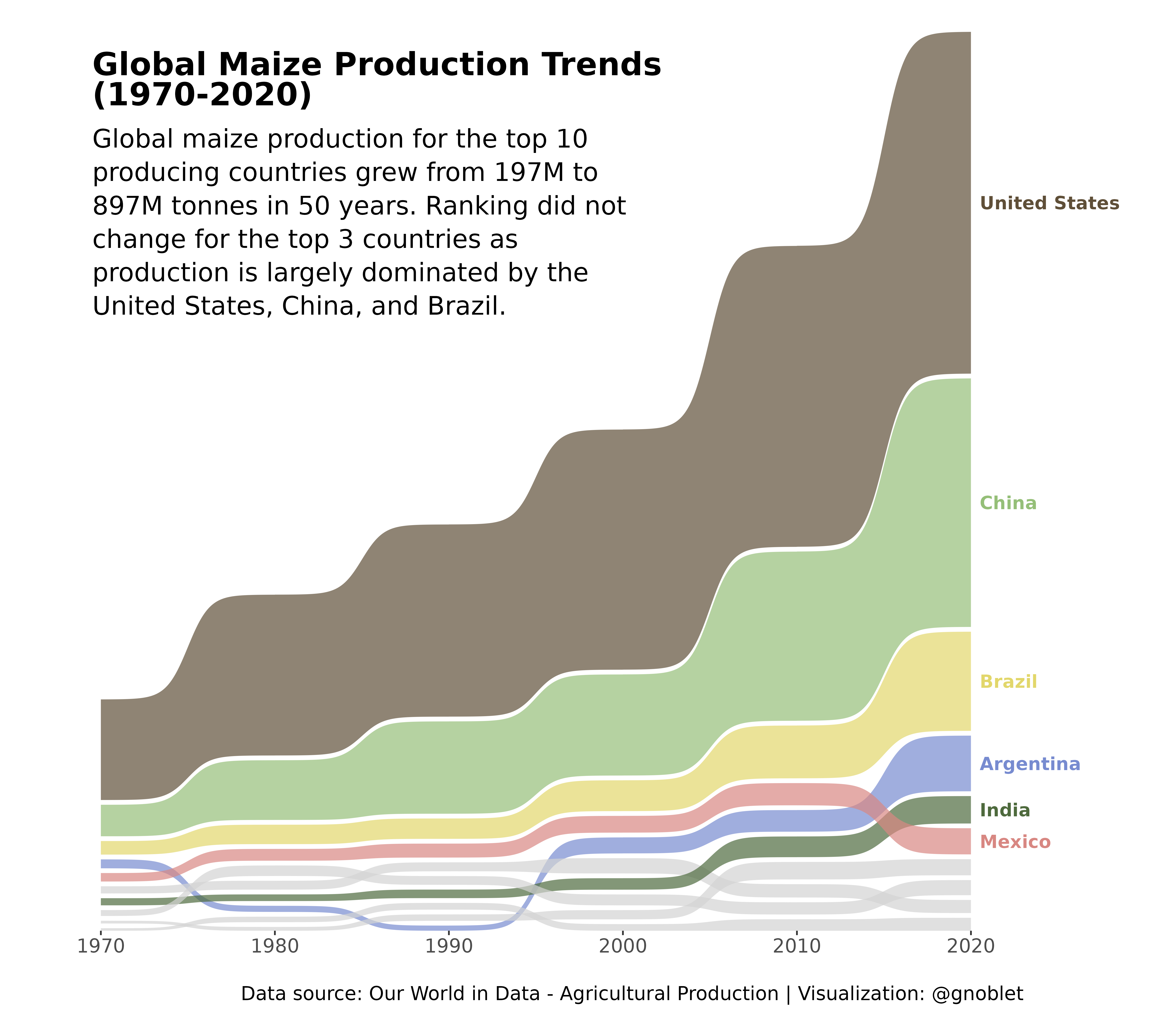
This visualization uses a Sankey bump chart to track maize production for the top 10 producing countries from 1970 to 2020. The chart highlights both ranking changes and production volume changes simultaneously.
owidapi (for data retrieval from Our World in Data)
data.table (for efficient data manipulation)
ggsankey (for creating the Sankey bump chart)
ggplot2 (for general plotting framework)
paletteer (for color palettes)
The process involved retrieving agricultural production data, filtering for maize production only, removing non-country entities, identifying the top 10 producing countries, and visualizing their production changes over decades. The thickness of each flow represents production volume, making it easy to observe both relative rankings and absolute changes simultaneously.