library(rio)library(data.table)library(ggplot2)library(showtext)library(sysfonts)library(patchwork)library(ggtext)library(owidapi)library(scico)library(refugees)library(paletteer)# Add Nunito fontfont_add_google(name ="Nunito", family ="Nunito")# Load and preprocess datadat <- refugees::idmciso <- refugees::countriessetDT(dat)dat <- dat[year ==2024]dat <-merge(dat, iso, by.x ="coa_iso", by.y ="iso_code")# Merge population datapop <-owid_get("population")setDT(pop)pop <- pop[year ==2023& entity_id !=""]dat <-merge(dat, pop, by.x ="coa_iso", by.y ="entity_id")# Calculate IDP proportion per populationdat[, prop := total / population_historical]# State of Palestine to Palestinee# Syrian Arab Rep. to Syria# Dem. Rep. of the Congo to Congo Kinshasadat[name =="State of Palestine", name :="Palestine"]dat[name =="Syrian Arab Rep.", name :="Syria"]dat[name =="Dem. Rep. of the Congo", name :='Congo Kinshasa']# Function to prepare top data and calculate anglesprepare_top_data <-function(data, column, top_n =30) {setorderv(data, column, order =-1) top_data <- data[1:top_n] top_data[, id :=1:.N] top_data[, coa_iso :=factor(coa_iso, levels = coa_iso)] angle <-90-360* (top_data$id -0.5) /nrow(top_data) top_data[, hjust :=ifelse(angle <-90, 1, 0)] top_data[, angle :=ifelse(angle <-90, angle +180, angle)]return(top_data)}top10_total <-prepare_top_data(dat, "total")top10_prop <-prepare_top_data(dat, "prop")# Function to create circular bar plotscreate_circular_plot <-function(data, y_column, fill_label, lab_f) {ggplot(data, aes(x = id, y =get(y_column), fill =get(y_column))) +geom_col(alpha =0.8, width =1) +coord_polar() +scale_y_continuous(limits =c(0, max(data[[y_column]]) *1.2),expand =expansion(mult =c(0.2, 0)) ) +geom_text(data = data[1:12],aes(y =get(y_column) + (max(get(y_column)) *0.05),label = name,hjust = hjust ),color ="black",size =4,angle = data$angle[1:12],family ='Nunito' ) +theme_minimal(base_family ='Nunito') +labs(x =NULL, y =NULL, fill = fill_label) +theme(axis.text =element_blank(),panel.grid =element_blank(),plot.background =element_rect(fill ="white", color =NA),legend.position =c(0.5, 0.1),legend.title =element_text(size =12),legend.text =element_text(size =10),plot.margin =margin(t =10, b =0) ) +scale_fill_paletteer_c("scico::acton",direction =-1,na.value ="lightgray",labels = lab_f,guide =guide_colorbar(direction ="horizontal", # Horizontal layouttitle.position ="top",title.hjust =0.5,label.position ="bottom",label.hjust =0.5,nrow =1,keywidth =unit(150, "pt"), # Balanced key size ))}p1 <-create_circular_plot(top10_total, "total", "Number of IDPs", lab_f = scales::label_number(scale_cut = scales::cut_short_scale()))p2 <-create_circular_plot(top10_prop, "prop", "Proportion of IDPs", lab_f = scales::label_percent(accuracy =1))# Create final layoutfinal_layout <- (p1 + p2) +plot_layout(widths =c(1, 1)) +plot_annotation(title ="<b style='font-size:30px; color:#260C3F;'>The Global Displacement Crisis (2024)</b><br> <span style='font-size:22px; color:#585380;'>Two Metrics to Visualize Internally Displaced Persons (IDPs) </span><br><br> <span style='font-size:16px; color:#404040;'> The left chart focuses on absolute numbers, showcasing the magnitude of displacement in countries like Sudan and the Democratic Republic of Congo. The right chart emphasizes the proportion of IDPs relative to population size, revealing the severity of impact in nations such as Palestine and Syria, where 1 in 3 people is displaced. <br> </span><br> <span style='font-size:14px; color:#9E9E9E;'>Data: IDMC displacement data extracted from UNHCR's 'refugees' package & Our World In Data | Plot: @gnoblet</span>",theme =theme(plot.title =element_textbox_simple(family ="Nunito",size =18,hjust =0.5,halign =0.5,# no margin below, even negativemargin =margin(l =30,r =30,b =0,t =10) ) ) )create_annotation <-function(curve_x, curve_xend, curve_y, curve_yend, text_x, text_y, label, text_width =30) {ggplot() +geom_curve(aes(x = curve_x, xend = curve_xend,y = curve_y, yend = curve_yend),curvature =-0.3,angle =120,arrow =arrow(length =unit(0.01, "npc")),linewidth =0.5 ) +annotate("text",x = text_x,y = text_y,label =paste(strwrap(label, width = text_width), collapse ="\n"),size =3.5,hjust =0,family ="Nunito" ) +theme_void() +coord_cartesian(xlim =c(0, 1), ylim =c(0, 1), expand =FALSE)}# Create final plot with annotationsp <-wrap_elements(final_layout) +inset_element(create_annotation(curve_x =0.67, curve_xend =0.74,curve_y =0.53, curve_yend =0.57,text_x =0.49, text_y =0.50,label ="In Palestine and in Syria, 1 person out of 3 is internally displaced.",text_width =36 ),left =0, right =1, bottom =0, top =1, align_to ='full' ) +inset_element(create_annotation(curve_x =0.18, curve_xend =0.25,curve_y =0.52, curve_yend =0.56,text_x =0.03, text_y =0.46,label ="In Sudan, there are more than 9 million persons displaced, not counting refugees that crossed borders.",text_width =30 ),left =0, right =1, bottom =0, top =1, align_to ='full' )# save figggsave("day_03.png",height =9,width =10,dpi =600,type ="cairo-png")
Final Plot
Notes
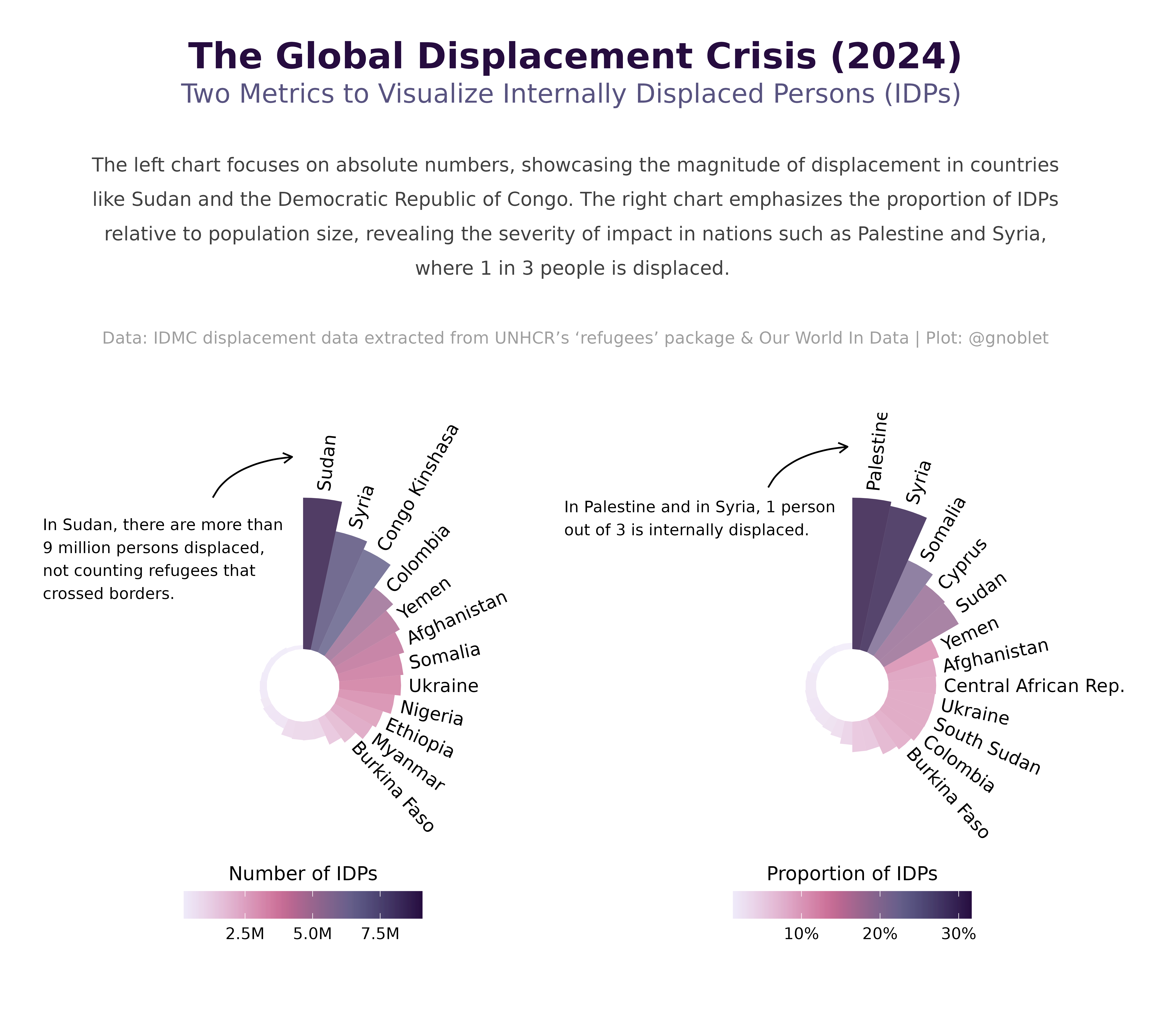
This visualization presents the global displacement crisis through dual circular bar charts, comparing absolute numbers and proportional impact of internally displaced persons (IDPs) across countries.
Data sources: - IDMC displacement data from the refugees R package - Population data from Our World in Data
Tools used:
data.table (for efficient data manipulation)
ggplot2 (for creating the circular bar charts)
patchwork (for combining multiple plots)
ggtext (for rich text annotations)
showtext (for custom typography)
scico (for color palettes)
The visualization uses polar coordinates to create circular bar charts that effectively display two different metrics: absolute numbers and proportion of population. This dual approach reveals important insights that a single metric would miss - countries with the highest absolute numbers of IDPs (like Sudan) may differ from those with the highest proportion of displaced population (like Palestine and Syria).